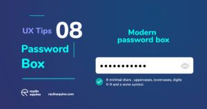
The second is better. Below I am gonna say why.
- Repeat the password is obsolete. Instead of that, use a single box with some rules for getting a strong password.
- Users need to know the process, show a micro-interaction guide is crucial. Ex. Password length animated bar, or a circle. It is up to you. The important is let them know what is the advance.
- Show password eye-button is a great tendency for showing the string version. It’s very important to enable it.
- Use an indicator of what must container the password: letters, uppercases, number? What more?
- Use an indicator of error with the indicated color.
- Let them know, if their password is the correct of a distinct way .


