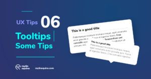
Tooltips are short messages related to specific UI elements that provide additional explanations and guide users towards taking specific actions. They’re triggered when a user hovers over an on-page item or when they click on an icon, a hotspot, or another active element.
The first one is better. Tooltips must have shadows, emphasis on important word and a good title if is possible. Don’t use super-clear color, or a title at the same size as rest of text.


